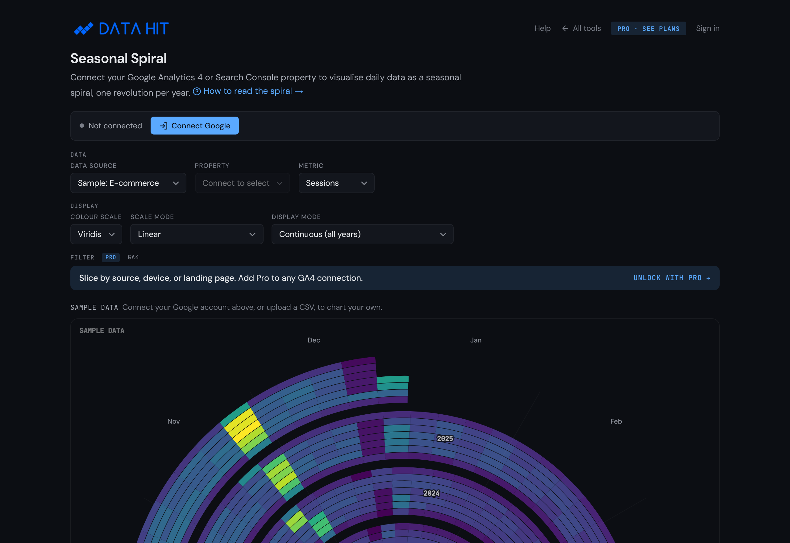
How to use the Seasonal Spiral.
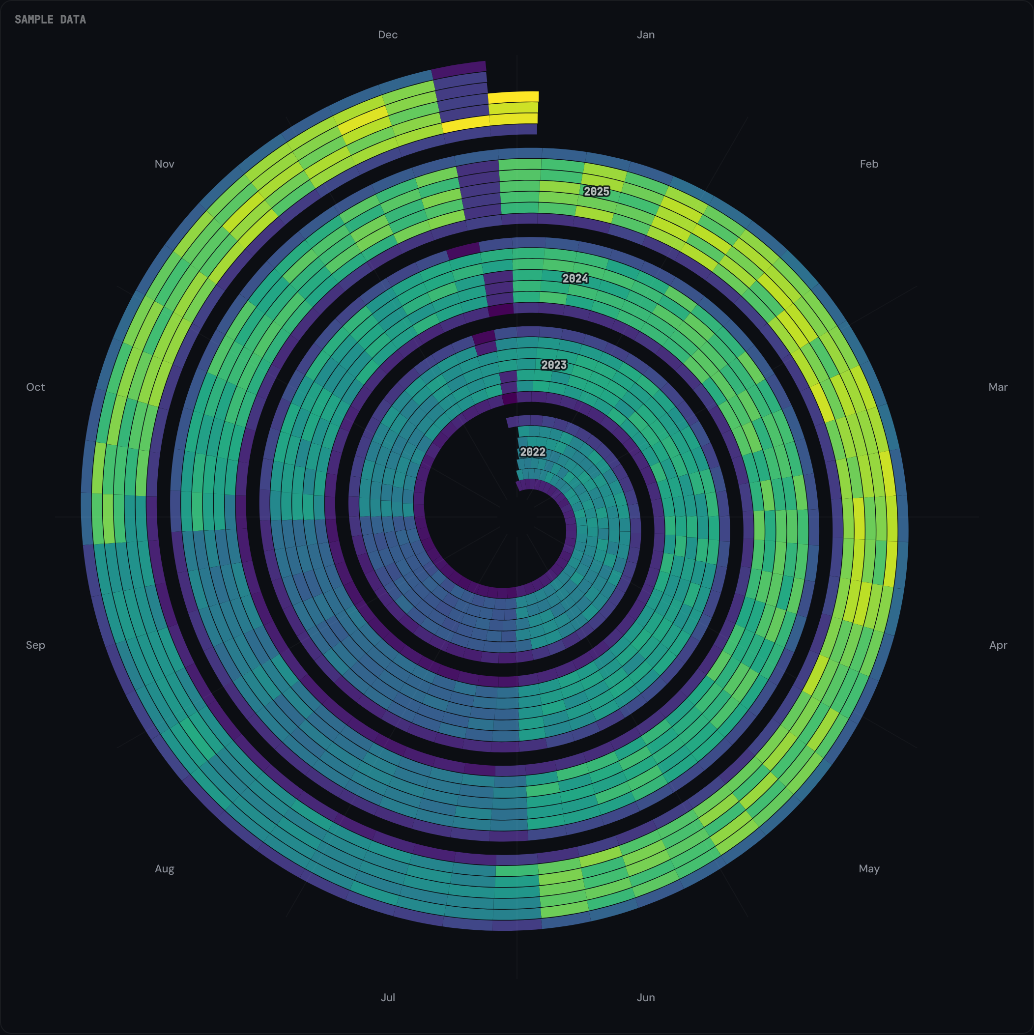
Seasonal Spiral winds daily GA4 or Search Console data into a spiral, one revolution per year. Weekly cadence and seasonal cycles become visible at a glance, and year-on-year shifts sit at the same angle on adjacent rings.
What this tool reveals
- Weekly rhythms. The angular position of each cell encodes day-of-year, so the same day-of-week appears at a similar angle on every ring. Quiet weekends or busy Tuesdays show up as repeating angular bands.
- Seasonal cycles. Summer dips, Q4 lifts, Black Friday spikes land in the same angular sector each year. Line charts compress these into a single x-axis; the spiral keeps them as a recurring shape.
- Year-on-year drift. Looking inward across rings at the same angle shows whether traffic is rising, flat, or falling for the same week of the year.
- Anomalies. Outliers (campaign launches, outages, viral spikes) appear as single bright or dark cells against an otherwise rhythmic background.
Most useful for analysts and SEOs who already know the headline traffic numbers and want to see the pattern underneath.
Setup in three steps
-
Open the tool
Visit tools.datahit.co/seasonal-spiral. The spiral loads immediately with sample data so you can explore the chart before connecting anything.
-
Connect Google Analytics 4
Click Connect Google in the top-left of the tool. The OAuth prompt asks for the read-only
analytics.readonlyscope. Approve, and the property dropdown populates with every GA4 property you have access to.Prefer to evaluate first? Skip this step. The sample-data options (e-commerce, B2B, seasonal) give a representative spiral with no data connection required.

-
Pick a property and metric
Choose a GA4 property from the dropdown. The default metric is sessions; switch to transactions, total revenue, or event count from the metric selector. The spiral re-renders in under two seconds.

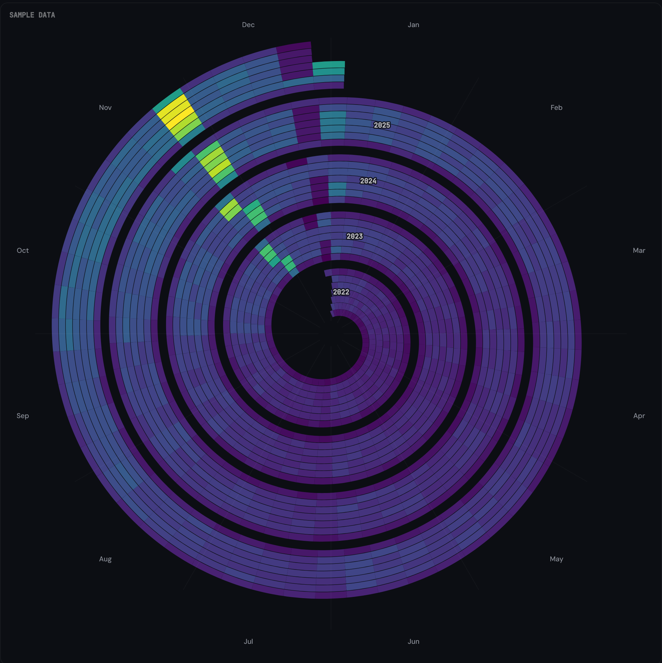
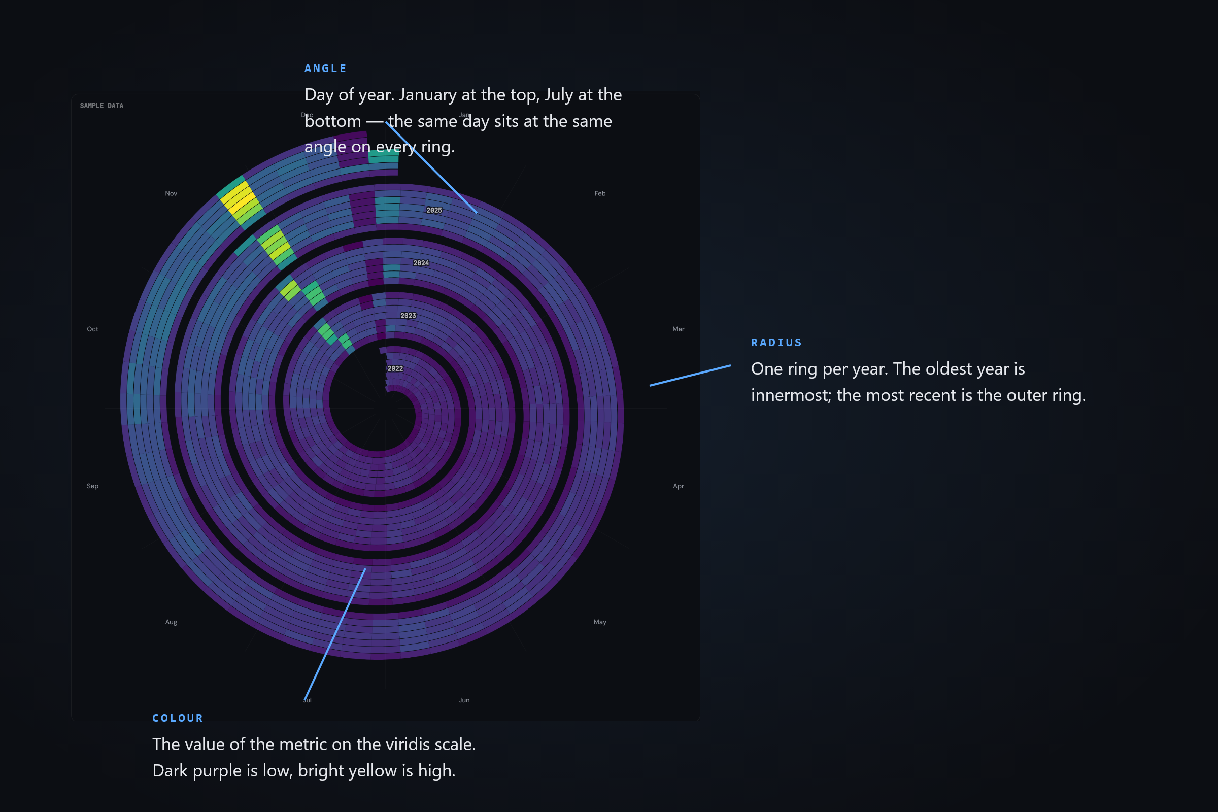
How to read the chart
The spiral has three encodings: angle, radius, and colour.
- Angle encodes day of year. January 1 sits at the top (12 o'clock), April to the right, July at the bottom, October to the left. The same day-of-year lands at the same angle on every ring.
- Radius encodes year. The innermost ring is the oldest year in the data; the outermost ring is the most recent. Each ring is a full year (52 weeks × 7 days = 364 cells, with a small calendar adjustment).
- Colour encodes the selected metric's value, mapped through the viridis colour scale by default. Dark purple cells are the lowest values; bright yellow cells are the highest. The legend strip at the bottom shows the exact range.
Sample insights
Black Friday spike
A retail GA4 property typically shows a bright cluster around late November on the outermost (most recent) ring, with a dimmer cluster at the same angle on the inner rings for historical Black Fridays. The spiral keeps these year-on-year comparisons spatially adjacent.
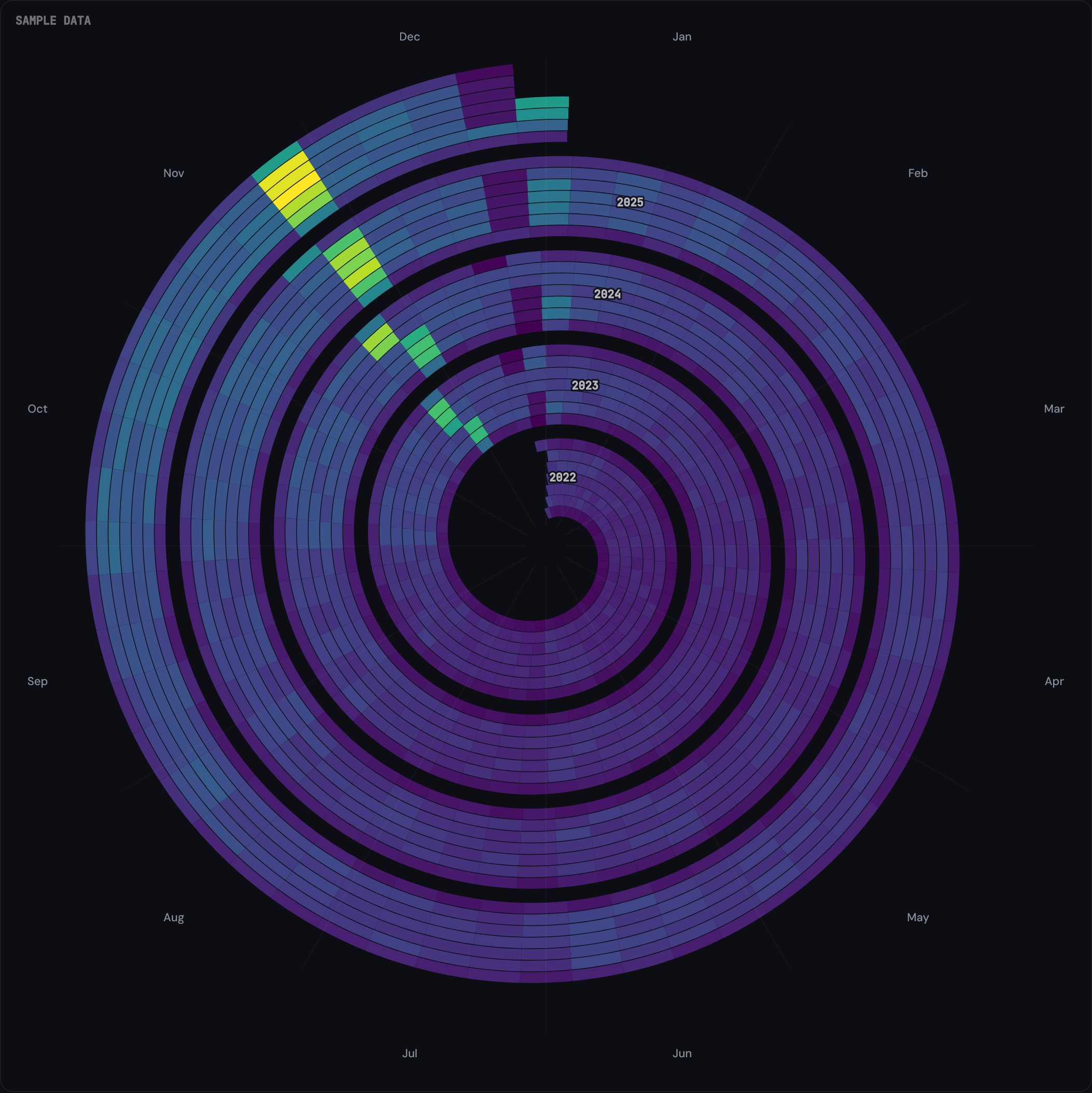
Seasonal peak
Travel and retail sites show a bright band in the same months every year — a summer peak for tourism, a Q4 lift for retail. Because the season lands at the same angle on each ring, a growing business shows the band brightening outward; a fading one shows it dimming ring by ring. (B2B sites often show the inverse: a dim summer crescent around the 6 o'clock position.)
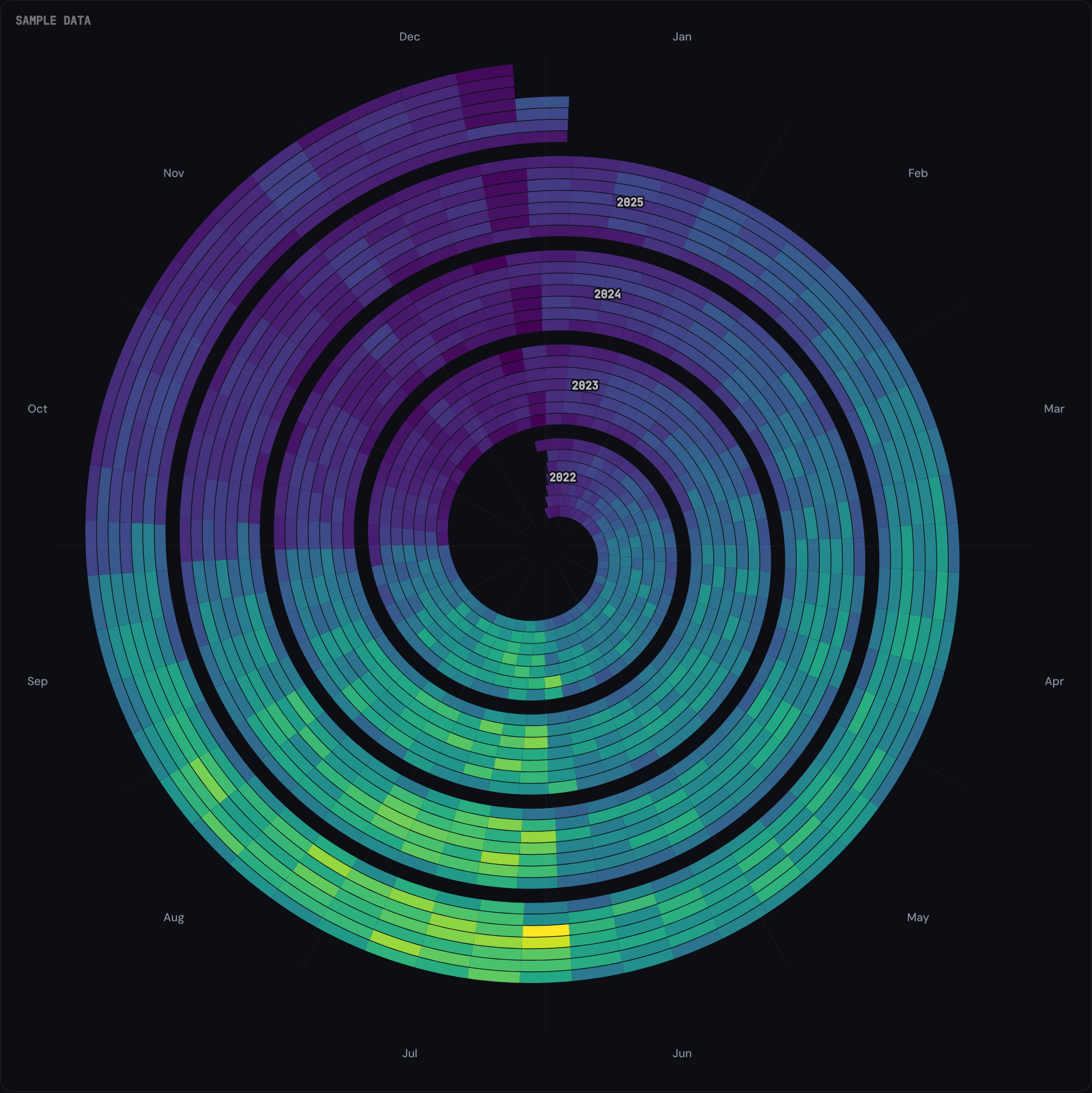
Year-on-year drift
Compare the inner and outer rings at the same angle. If most outer-ring cells are brighter than their inner-ring counterparts, the metric is trending up. The spiral makes this visible per-week rather than as a single trend line.
Methodology
The tool fetches daily aggregates from your selected GA4 property using the GA4 Data API (runReport) with the date dimension and your chosen metric. Up to five years of history is requested. The data comes back as a JSON array of {date, value} pairs.
Spiral geometry is computed in your browser. Each cell is an annular wedge whose angular start and end are derived from day-of-year, and whose inner and outer radii are derived from the year. Cell colour is interpolated against the viridis ramp based on the metric value's percentile within the dataset. No raw data leaves your browser.
Privacy and data flow
The OAuth scope requested is analytics.readonly: read-only access to your GA4 properties. No write permissions are requested.
The access token returned by Google is held in browser memory for the session only. When you close the tab, the token is gone. No DATA HIT server sees your GA4 data.
The Pro tier (paid, optional) stores saved view configurations (property ID, metric choice, colour scale, day-of-week filter) so you can return to a setup later. Pro does not store raw analytics data. See Privacy policy for the full mapping.
Frequently asked questions
Does the Seasonal Spiral work with Universal Analytics?
No. The spiral connects to Google Analytics 4 only. Universal Analytics stopped collecting data on 1 July 2023 and its API was retired on 1 July 2024.
How many years of history does the spiral show?
Up to five years by default, depending on how far back your GA4 property has data. The spiral renders one revolution per year, so three years of data shows three concentric rings, five years shows five.
Which GA4 metrics can I visualise?
Sessions, transactions, total revenue, and event count (with an optional event-name filter for events like generate_lead). The colour scale (viridis by default) maps the chosen metric's value to each cell's fill.
Can I export the spiral?
PNG export is available from the tool's controls (the export icon in the top-right of the chart). CSV export is on the Pro tier.
Why does the chart take a moment to load?
It fetches up to five years of daily data from your GA4 property and computes the spiral geometry client-side. Typical render time is under two seconds; very large properties or slow connections may take a few seconds longer.
Is my GA4 data sent to a DATA HIT server?
No. The OAuth handshake routes through Google directly; the access token returned is held in browser memory for the session only. Chart computation and rendering happen client-side. There is no DATA HIT server in the data path.