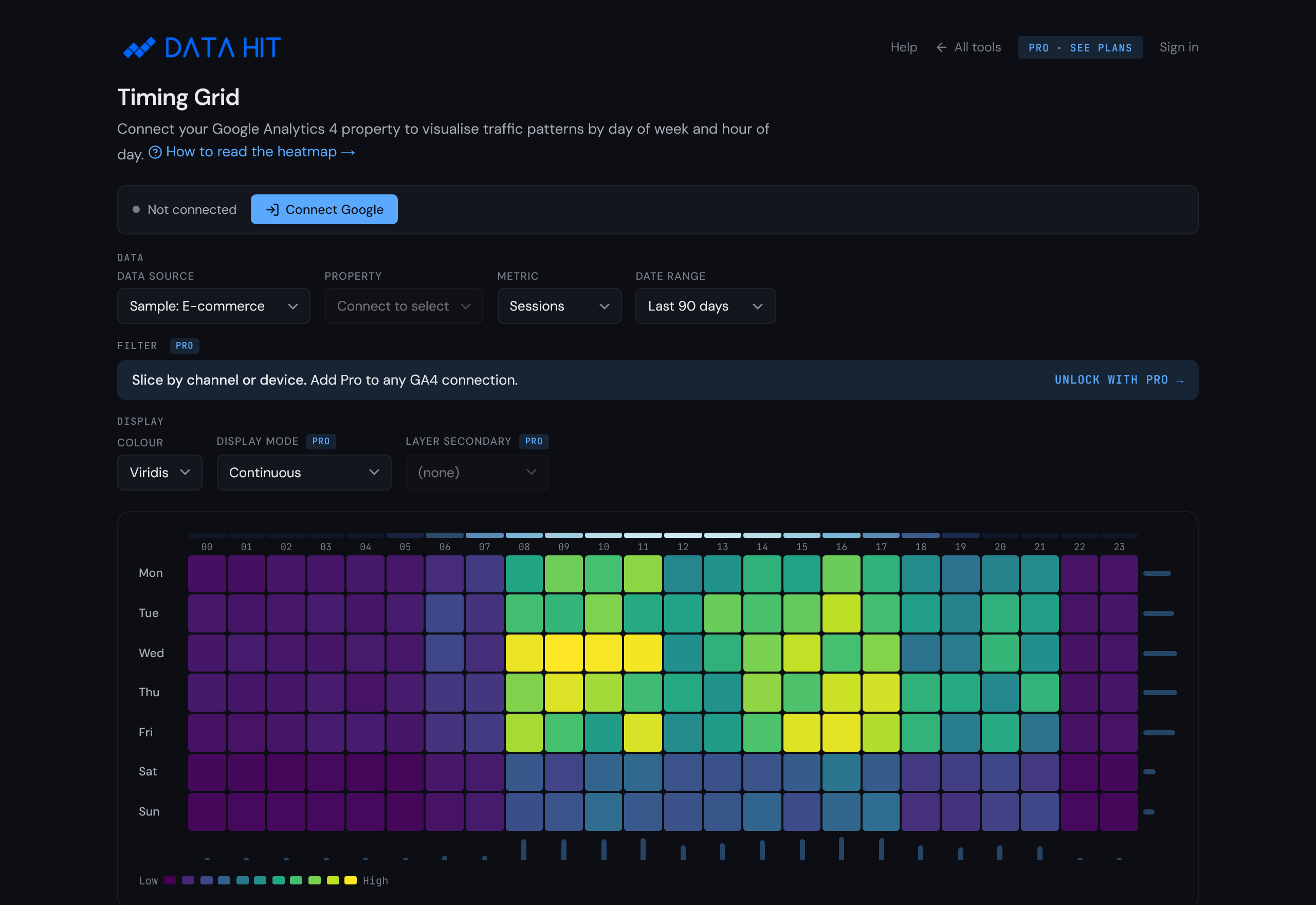
How to use the Timing Grid.
Timing Grid breaks GA4 traffic into a 7-day by 24-hour heatmap. Peak windows for ad-spend scheduling and high-engagement slots for cold outreach become visible at a glance.

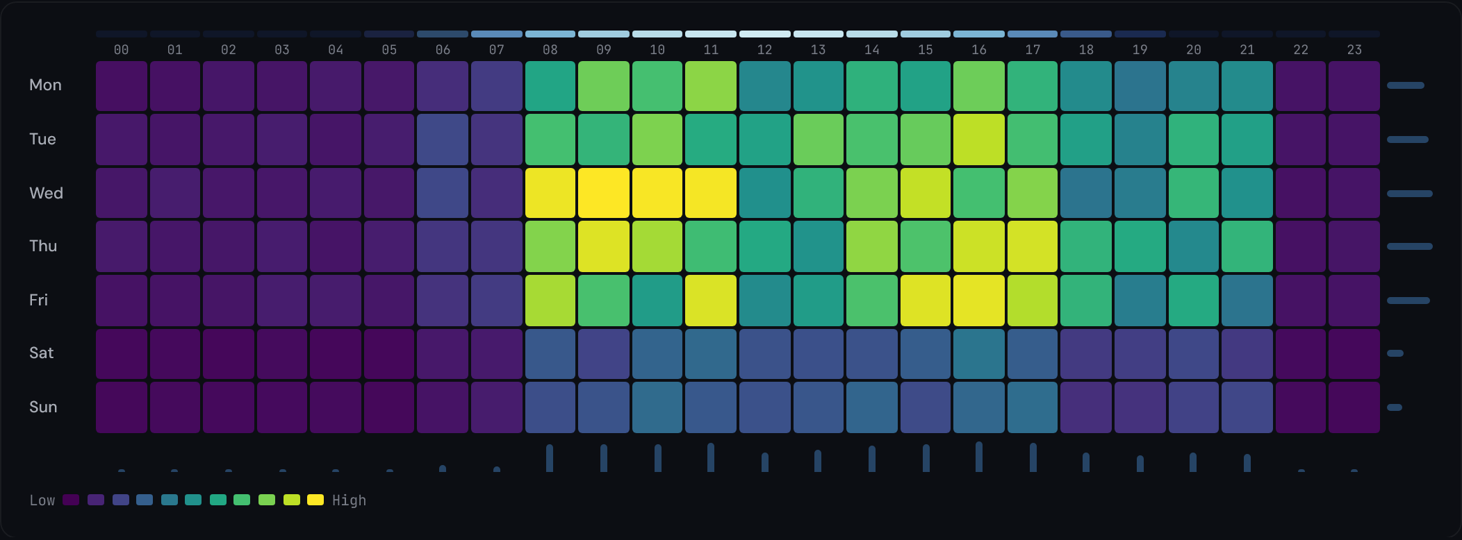
What this tool reveals
- Peak hours. The brightest cells across a row tell you when a given day-of-week peaks. Useful for Google Ads scheduling and email send-time optimisation.
- Weekly cadence. Compare rows: a B2B site shows Mon-Fri saturation with quiet weekends; a content site often shows weekend lift with Tuesday + Wednesday peaks.
- Hour-of-day shifts. Look at one column across all seven rows. If 09:00 is bright on weekdays but dim on weekends, you have commute-time traffic.
- Quiet windows. The darkest cells point to hours when sending email, running scheduled posts, or deploying changes is least likely to disturb users.
Setup in three steps
-
Open the tool
Visit tools.datahit.co/timing-grid. The grid loads immediately with sample data so you can explore the heatmap before connecting anything.
-
Connect Google Analytics 4
Click Connect Google in the top-left of the tool. The OAuth prompt asks for the read-only
analytics.readonlyscope. Approve, and the property dropdown populates with every GA4 property you have access to.Prefer to evaluate first? Skip this step. The sample data gives a representative grid with no data connection required.

-
Pick a property, metric, and time range
Choose a GA4 property. The default metric is sessions; switch to users, page views, conversions, or revenue from the metric selector. The default time range is the last 30 days; pick longer ranges (up to 12 months) for smoother patterns, or shorter ranges (last 7 days) for recent campaign timing.

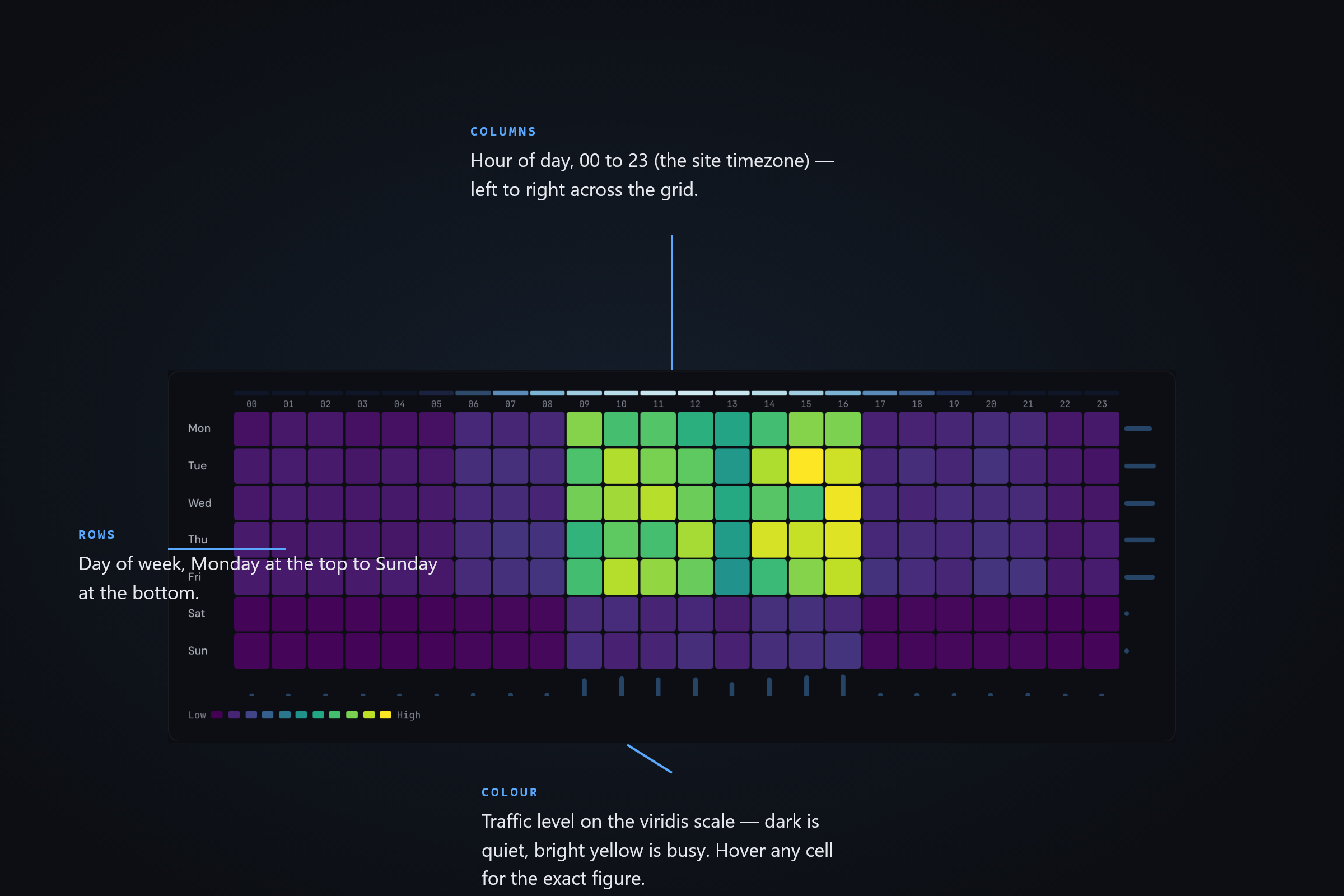
How to read the chart
The grid has three encodings: row, column, and colour.
- Rows are days of the week. Monday at the top, Sunday at the bottom (UK convention; the labels match the visible header).
- Columns are hours of the day. 00:00 on the left, 23:00 on the right, using your GA4 property's reporting time zone.
- Colour encodes the selected metric's value, mapped through the viridis colour scale. Dark purple cells are the lowest values; bright yellow cells are the highest. The legend shows the exact range.
Hover any cell to see the exact metric value for that day-of-week and hour-of-day combination.
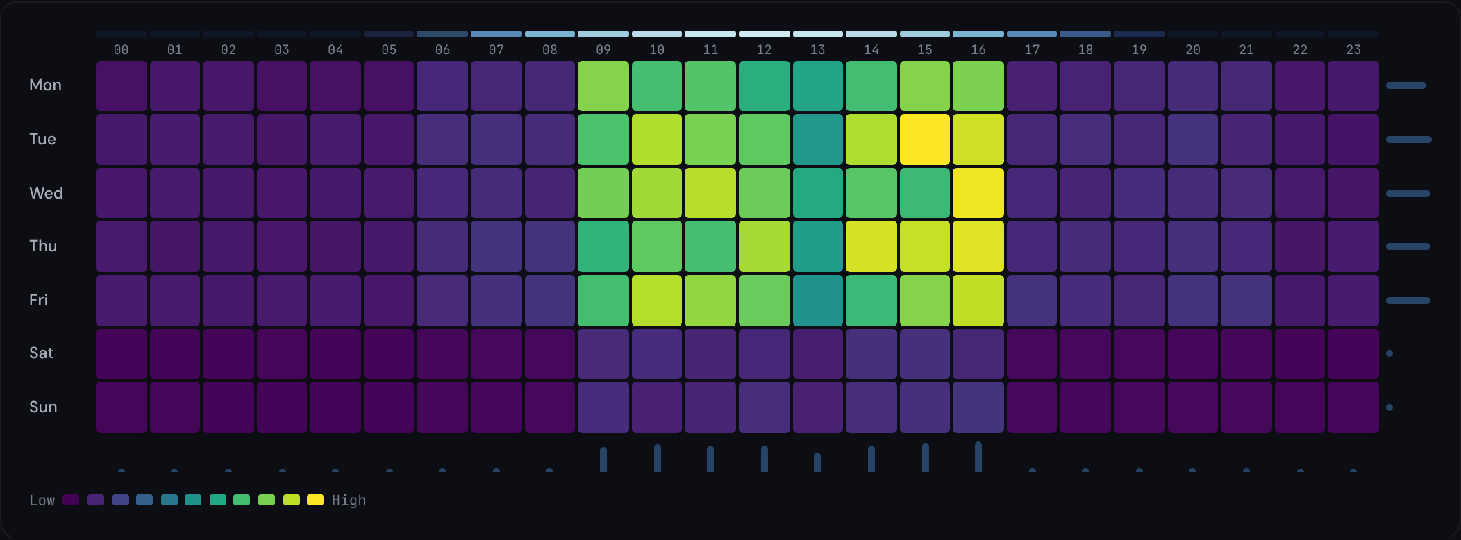
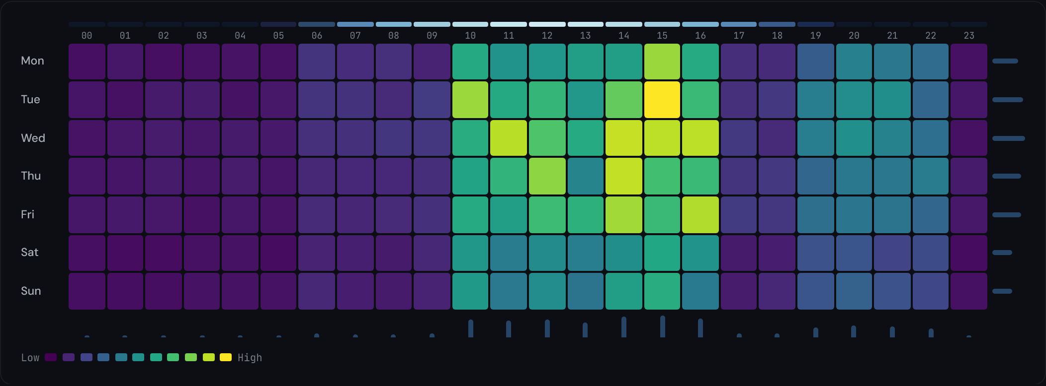
Sample insights
B2B weekday peak
A B2B SaaS property typically shows a saturated rectangle from Mon-Fri, 09:00-17:00, with quiet weekends. Ad scheduling should concentrate spend inside the saturated rectangle; weekend bidding can be paused entirely.
Content site evening lift
News and content sites typically show two daily peaks: commute (07:00-09:00) and evening (19:00-22:00). The evening peak often extends into weekends. Outbound emails sent at 18:30 catch the rising edge of the evening peak.
Retail shopping hours
Switch the metric to revenue and a retail property concentrates its value in weekday shopping hours — late mornings and lunchtimes through the working week — with steadier, lower browse traffic across the weekend daytimes and quiet nights. Promotional emails land best in the bright weekday late-morning window this heatmap makes obvious.
Methodology
The tool fetches your GA4 data using the GA4 Data API (runReport) with two dimensions: dayOfWeek and hour. The chosen metric (sessions, users, etc.) is aggregated across the selected time range, producing a 7-row by 24-column matrix.
Cell colours are interpolated against the viridis ramp based on the metric value's percentile within the matrix. The percentile mapping (instead of absolute min/max) means a single outlier doesn't wash out the rest of the grid.
No raw event-level data leaves your browser. The GA4 API returns pre-aggregated counts; the tool renders them.
Privacy and data flow
The OAuth scope requested is analytics.readonly: read-only access to your GA4 properties. No write permissions are requested.
The access token returned by Google is held in browser memory for the session only. When you close the tab, the token is gone. No DATA HIT server sees your GA4 data.
The Pro tier (paid, optional) stores saved view configurations (property ID, metric, time-range, secondary-metric overlay choice) so you can return to a setup later. Pro does not store raw analytics data. See Privacy policy for the full mapping.
Frequently asked questions
What time zone does the grid use?
The grid uses your GA4 property's reporting time zone. If your property is set to London, the 09:00 column means 09:00 local time. Check Admin > Property Settings in GA4 to confirm.
Does the grid handle daylight saving time?
Yes, implicitly. GA4 timestamps each event in the property's local time zone with DST already applied, so the grid treats local-time hours as-is.
Which GA4 metrics can the grid show?
Sessions, users, page views, conversions, revenue, and event count (with an optional event-name filter). The colour scale maps your chosen metric per cell.
Can I overlay two metrics?
Yes, on the Pro tier. Pro adds 'delta mode' (period vs period comparison with a diverging colour scale) and multi-metric layering (a secondary metric drawn as a bar overlay within each cell).
How much history does the grid use?
30 days by default. Longer ranges are available via the time-range selector, up to 12 months. Longer ranges smooth out anomalies; shorter ranges pick up recent campaign timing.
Can I export the grid as a Google Ads bid-schedule CSV?
Yes, on the Pro tier. The export translates each cell's percentile into a bid adjustment percentage compatible with Google Ads ad-scheduling rules.